Not so long ago, for nearly every form field more complicated than a simple text/numeric field, we needed libraries. Today, browsers offer color and date pickers. Moreover, mobile devices can display different keyboards depending on the type of data we need to input into a given field, which further enhances the UX of applications.
Is there anything else we can do?
In HTML, there is a <datalist> tag. Inside, it contains a list of <option> tags (which you might associate with the <select> element) that are suggested choices for the user. You can associate the datalist element with a field by giving it the value of the list parameter as the datalist’s id.
How does a field with a datalist differ from a select? The values in the datalist are suggestions. The user can still choose or enter a different value. The select field, on the other hand, limits the choice to the presented options.
How can showing suggestions to a user improve the usability of an application? Stay with me, and I’ll show you a few examples!
You can check out the live version of the example as well as the source code on Github.

Text field
Quite often, we can roughly predict what users will enter into a text field. For example, a favorite animal – for most people, it will be a dog or a cat. Occasionally, some other responses may come up, such as “a horse”. With this knowledge, we can create a list of suggestions to speed up filling in this field a bit.
Chrome Desktop
Look at how such a list appears on desktop Chrome:
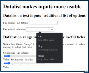
The user is shown a list of items along with an additional description. This description can be used to provide the user with a broader context, for example in banking applications.
Edge
On the Edge browser, which also runs on the Chromium engine, the hints are displayed similarly, they’re a bit clearer than on Chrome.

Firefox
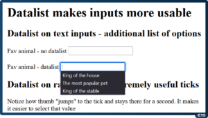
Firefox browser also displays hints, but in this case, only the descriptions are shown. This can make handling a bit more complicated, as the user might not necessarily understand why they are clicking on an option and something different appears in the field.
Chrome Android
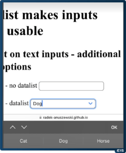
Chrome on Android handled the issue best.
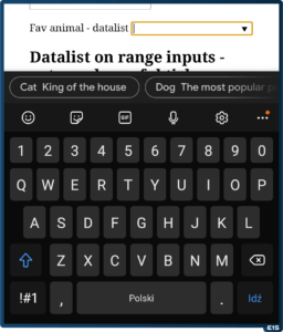
The user sees a full list of suggestions that they can scroll through while simultaneously being able to type from the keyboard.
Safari iPhone
Safari on iPhone behaves similarly to Chrome on Android operating system, displaying the hints as a list – but without the descriptions.
Range field
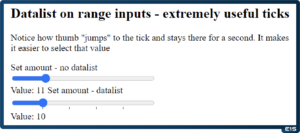
This field is often used as a substitute for the number type field. Sometimes it’s faster to slide the slider than to enter a number. However, there is one issue – it can be difficult to choose an exact value, like 5 or 10. This is where the datalist comes in, allowing you to mark these values.
Chrome Desktop
Thanks to displaying ticks, it’s easier to select the value we need.
Edge
On Edge browser, the situation looks identical to desktop Chrome.
Firefox
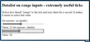
Firefox displays the ticks in the same way as other browsers, but one gets the impression that it does so a bit more clearly than Chrome and Edge.
Chrome Android
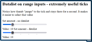
Chrome in its Android version looks identical to the desktop version. However, moving your finger tick “attracts” the slider, so the ergonomics seem better than on the desktop.
Safari iPhone
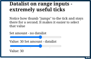
Safari on iPhone displays the ticks the best when it comes to aesthetics, but the downside is that they are covered by the slider.

Datetime field
It seems that in this situation the datalist is most useful. Choosing a date, especially when selecting an hour, can be quite complicated and time-consuming. For instance, when picking a date for a meeting or an appointment, it would be useful to immediately provide the earliest possible dates as quick selection options. And this is made possible thanks to the datalist.
Chrome Desktop
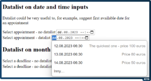
Chrome browser utilizes the datalist in a very handy manner – it displays the date in a readable format as well as a description. This way, we can immediately convey additional information, such as appointment pricing.
Edge
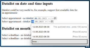
In this case, Edge browser behaves identically to Chrome browser.
Firefox
Unfortunately, as of the time of this entry (September 2023), Firefox does not support calendar hints.
Chrome Android
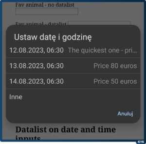
Chrome on Android also works very well. Unfortunately, it can sometimes truncate the description – it’s a pity it doesn’t wrap it to the next line.
Safari iPhone
Safari does not display hints for the datetime field.
Pole month
We don’t always need as precise a date as mentioned above. For example, when providing estimates for the completion of a task or project, a month might be more valuable than a specific day.
Chrome Desktop
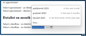
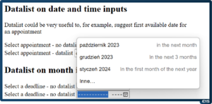
Chrome, similar to the date case, displays a readable value and description. Thanks to this it’s the most user-friendly approach to the topic.
Edge
Edge browser, in the case of datalist month, behaves identically to Chrome.
Firefox
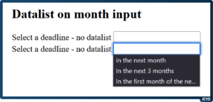
Firefox does not support the “month” type, so the field behaves like a text field – where FF displays descriptions of available options.
Chrome Android
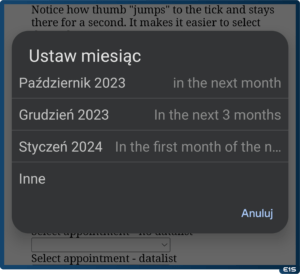
On Android, similarly to the datetime case, the only issue is truncating the description text of the hint.
Safari iPhone
Safari browser does not display hints for the “month” type field.
Summary
At first glance, the seemingly unnecessary datalist element turns out to have many interesting uses. Especially when we know the user better and can predict their behavior, we can further assist them with hints.
However, one should be cautious – despite broad support, some browsers (like Firefox at the time of writing this entry, September 2023) can create some confusion.

